The Fifth Surface: Why the Wall Behind Your Worktop Deserves a Real Decision
There's a moment near the end of every kitchen project when somebody props a sample against the wall, steps back, squints, and says: that'll do. It's easy to see why. By that stage you've already argued about drawer dividers, signed off the worktop and spent a fortnight comparing extractor hoods. The wall behind the worktop feels like the trailing edge of the job.
It isn't. That surface — call it the fifth surface, after floor, walls, cabinets and worktop — sits at eye level, catches every bit of light in the room, and takes the daily punishment of kettles, pasta water, spitting pans and the Sunday roast. Get it wrong and the kitchen looks dated before the kettle has boiled. Get it right and nobody notices, which is precisely the point.
The surface doing the quiet work
Splashbacks get called finishes, which undersells them. A finish is what you put on last. A splashback is a working surface turned ninety degrees: it has to survive heat, steam, grease and the occasional over-enthusiastic whisk, and it has to do so in the most visible strip of the room.
That double duty is why the decision is harder than it looks. A worktop can be busy, because you look down at it from a distance. A splashback is right there, at the height of your face when you're standing at the counter. Bold veining in quartz reads as luxury under your hands; the same slab running up the wall can read as noise. That's not an argument against taking the worktop up the wall — more on that below — just a reminder to look at any material vertically before you commit.
Three heights, three different rooms
Most British kitchens land on one of three setups, and they feel completely different.
The upstand is the modest version: a strip of worktop material, usually 100–150mm, tucked up behind the counter. It's the least expensive way to protect the plaster, it keeps the splash zone tidy, and it makes the worktop look properly resolved rather than simply cut off. If your walls are doing something interesting — panelling, a good paint colour, a picture rail — an upstand stays out of the way and lets them get on with it.
The mid-height splashback runs from the worktop to the underside of the wall units, typically 450–600mm. This is the workhorse. It's also where tiling earns its keep, because it's a defined panel you can afford to be a bit more decorative with.
Full height goes to the ceiling, or to the underside of a chimney breast, or up behind a range cooker. It's the most dramatic and the most expensive, and it changes the proportions of a room — often making a low ceiling feel lower, but making a narrow galley feel taller and more generous. Use it where you want the eye to travel up rather than sideways.
What each material actually asks of you
Glass is the closest thing to maintenance-free. A single toughened panel with no grout lines wipes clean in one movement, bounces light back into the room, and comes in colours from barely-there to properly saturated. The catch is sequencing: it has to be templated, so it's measured once the worktop is in, and it turns up a couple of weeks later. Book it early or you'll be eating off a camping table wondering where the splashback has got to. Consider low-iron or optically clear glass if you want colour without a greenish cast, and a matt or satin finish if you can't bear looking at every watermark.
Tiles are the flexible option and the one most people picture. Metro, zellige, penny rounds, plain gloss squares — the range is enormous. What differs is the grout. Every tile brings a grid of joints, and joints collect grease. A large-format tile with a slim grout line in a mid-grey is easy living; a small mosaic in white grout behind a hob is a weekend chore you've signed up for. If you're tiling around a gas hob, check the hob manufacturer's instructions — most call for a non-combustible surface behind and above the burners, and your fitter will know the current guidance.
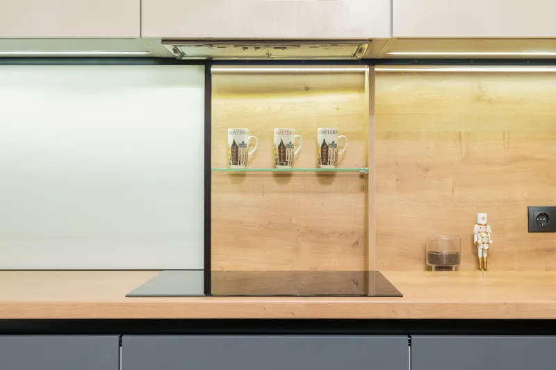
Worktop material carried up the wall is the calmest option and, in my view, the most underrated. It gives you one uninterrupted plane from counter to cabinet, hides the joint between the two, and makes a small kitchen look bigger because there's nothing to break the eye. Quartz, sintered stone and solid surface all do this well. Wood does too, but it needs re-oiling and it doesn't love being near a hob.
Stainless steel is the professional's answer: heat-proof, hygienic and honest about it. It will scratch, it will show fingerprints, and some people love exactly that.
Brick slips, sealed plaster and panelling behind a sink all have their fans. They look wonderful. They also ask more of you, particularly in wet or greasy zones.
Blend, echo or interrupt
Colour is where splashbacks get interesting, and there are only three sensible strategies.
Blend: match the splashback to the wall or the cabinets so the surface disappears and the worktop becomes the star. Safest route, and it makes rooms feel larger.
Echo: pick up a secondary colour from the worktop veining, the floor, or a single repeated element — brass, say, or the colour of the tiles in the hallway. It reads as considered without shouting.
Interrupt: go deliberately contrasting. Deep green behind pale oak, warm terracotta against grey, dark glass above a light worktop. This is the route that gives a kitchen personality, and the one most likely to feel tired in a decade. If you're going to interrupt, do it somewhere you can change cheaply — a tiled panel, not a slab.
The two-minute test before you decide
Stand at the hob as if you're cooking, then look straight ahead. That's the strip you'll be looking at for the next fifteen years. Now look up: does the surface stop on a line you actually like, or does it end in the middle of nowhere? Finally, count the grout lines within arm's reach of the sink.
Whatever you choose, settle it before the worktop is ordered rather than after. It's one of the cheapest decisions to get right and one of the most irritating to redo.